Design Philosophy

I am a junior interior design major at Washington State University. I have always been interested in design. I enjoy creating abstract and organized spaces. Figuring out corrections to problems through design is a process I believe is fundamental. When I design I want to meet the needs of a client in a creative way. I like to find multiple solutions to a problem to hear opinions to consider a different approach. I think design should have meaning, and that is what I strive to tell in my designs.

Showing posts with label 197SP11. Show all posts

Thursday, May 5, 2011

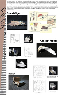
Bench Design Process Poster


From this project I gained more experience in Photoshop and InDesign. I used Photoshop to create my header and to correct images on the poster. I used skills I gained throughout this year to create my header and correct images. This poster was a great way for me to learn organization of things. People being able to understand what I am saying and not being distracted by unorganized materials was what I was striving for. The texts I chose, I think are a little safe but work well with the over all design layout. Working with negative space could have been achieved differently, but I am pleased with the final product. I also got more experience with writing in design terms with my concept statement located at the top of my poster because I have not had much experience in that department.

Outside Macro Sketchs


This one of my favorite sketches because I was able to mix in color. It is always fun to use new medias. These sketches helped me focus on details more, and was interesting because if you do not necessarily know what the sketches are you could assume they are anything.

Kitchen Still Life


I drew this sketch on Easter Sunday and found it fit to draw the bunny ears with some utensils. I was having issues with perspective, but I like the idea of this sketch. I think once I have more practice with drawing texture this sketch will be much better.

Chair Sketch


This is an older chair from my dorm lobby and I chose to draw it because it was not too complex, so I could focus on drawing in perspective. I learned more about perspective with this sketch. I could have added more detail.

Value Study in Line


I like this sketch because it taught me multiple ways to look at light casting shadows. I am still working with perspective views and I think they are getting better, but it is hard to show detail while using a pen.

Erased Negative Space


I liked this sketch because it was taking a 3D object into a 2D form. It was different drawing with the eraser, but it helps me understand the medias more. The bike shape was complex and this sketch helped me realized it can be seen in a not so complex way.

Chair Negative Space


This sketch was interesting because i learned to look at a form instead of all the details in a new way. I had to start over a few times with this sketch because I kept wanting to put in the details. I learned that This sketch turned out very interesting because it is like a white shadow instead of black.

Small Hardware Element on Black Paper


This was about what was most important in the sketch frame. The dominant element stands out before the background. This is a hinge of a window that is brown/brassy colored. I chose to use pink for the handle and lighter colors for the background, so the hinge would be the focus. From this drawing I learned more about perspective and importance.

Figure Tracing from Photograph


I am glad that I traced the figure drawings before this sketch because I was more familiar with the media. Tracing a figure is interesting because it is not about every detail, it is about the shape.

Figure Tracing from Figure Drawings


This was difficult because the media was an ink pen. I had to get used to the pressure I needed to use. With the figure tracing it was helpful to watch the paper with the figure drawn and not where your hand was moving. This was to see if the figure would come out the way it should.

Fruit Cross Section


This is a cross section of an apple and tomato. The apple was easier to draw from me because the shape was specific, but the tomato was difficult. I could improve on the line weights of pencil used, and work on my perspective. Light spots are hard for me to do because I try to draw them, but I need to think about what not to draw.

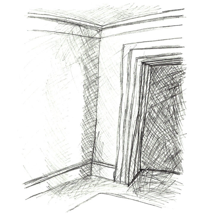
Shade and Shadow of a Room Corner


This is the corner of the lobby in my dorm building. I learned more about perspective with sketch. And the shading was a bit tricky, but you just have to keep sketching even if it looks weird at the beginning because the sketch will come together.

Sketch Book Cover and Reflection


Wednesday, April 20, 2011

Resume


I was glad to revise the resume I had put together because creating graphics on the resume makes it more professional. I needed to reorganize my resume because I had not done so for a while. Through the reorganizing I realized the knowledge I have about my skills and experience. It was also interesting to work with my logo on my resume I will use.

Wednesday, February 16, 2011

Textile Design


Combination Heritage

The idea generator was heritage and the combination of Russian, German, and French heritages creates this American heritage. The form-giver was used with the colors of pink to tie all the different heritage objects together. The objects were all so different and the color pink was a unifying for all of them. The color pink was chosen as the unifying color because the dominant floral background had pink flowers. Knitting is a past time tradition of the family and is symbolically resembling how all the heritages weave together. The applications of these heritage objects to create this textile are placed on a floral pattern which represents the French heritage as a main component, because the letter “P” is for the French last name, Pharmer. The flowing curves of the knit piece show how the heritages have separate features, but are intermingled together to create a unified design.

I created a textile based on my heritage of Russian, German, and French decent. I feel like I learned more about my heritage through this design. I did this design in Photoshop and again learned many useful new skills. I do like my textile on paper, but I am not sure if it would be the same in fabric. Through this textile creation I was inspired to think that one day I could design fabrics for furniture. This was an abstract piece that I learned more about design from.

Geometric Pattern


Through creating my geometric pattern I became more familiar with the Photoshop software. I choose six images and manipulate, beyond recognition, them using Photoshop, then put these manipulated pictures in a geometric pattern. I used colors that I felt worked well together. I feel like I did not connect these images well enough, but with the skills I had at the time, I think I did pretty well. This pattern helped expose me to Photoshop and I feel like I learned a lot about the program.

Sketch: Chair Views


This is a sketch of the office chair in my dorm room. I drew the chair from perspective, top, underside, side, and front views. I estimated the lengths of the back rest, seat, and the seat to floor. I also labeled the fabric used and the materials the chair was made of, from what I could tell. This sketch helped me see the different views of what I am physically looking at. When I draw a room I tend to draw things not as they are really seen, but how I imagine them. I will draw some from perspective and others from front view when those are not the views I am actually seeing them. This sketch helped me visualize what I am seeing.

Sketch: Napkin Floor Plan


This is a napkin sketch of the floor plan of my dorm floor, mostly. I did the floor plan of my dorm room, the hallway, and the bathroom because these are all spaces I see everyday. It was a bit difficult to draw on a napkin with so much texture, but it was interesting to see how much of the floor plan I could remember without having it in front of me. There is also a small perspective view of the door of my dorm room.

Sketch: Mind Map


I started this mind map off with the word "blank", this is because I was sitting in my bare white dorm room. I then branched from the word "blank" anything that sprang to my mind, some pertaining to design. I would add color and sketches of any words that I could match an image to.

Sketch: Fruit


This sketch was done by using the cross hatching drawing technique. I had never done it before, but I was pleased with the results. Each new piece of fruit I drew I felt like I was getting the hang of the cross hatching technique.