I went on a job shadow with an interior designer in the healthcare department at Callison architecture firm. At the job shadow I was able to see what it is like to work in a studio with a bunch of professionals. I got to see integration of architects and interior designers, which was interesting because the WSU school of design will be collaborating like what happens in a real studio. I got to see lots of materials that were cutting edge, too. Their materials room had many different types of lighting so that materials could be seen in the type of lighting that would be on site. I went to a job site with my designer and it was interesting to see something that she had in floor plans and elevations in person.
Here is a link to the Callison healthcare department website to see some of the projects they have done.

Megan Pharmer: Interior Design Portfolio
Sunday, October 16, 2011

St. Ignatius Church Sketches
This is a church in Seattle, Washington that I was able to sketch. It was built by an architect that had the concept of St. Ignatius' writings. I do not know the writings of St. Ignatius, but I heard they had to do with light being God. The architecture of this church captures lighting in many different ways through windows and ceiling heights that create shadows. From these sketches I strengthen my sketching abilities, and I learned what can be done with lighting in a space.

This is an exterior view of the entrance into the church. The windows on the door let light into the structure at different angles.

This is a sketch of a wall that had a protruding wall coming out of it. This wall let light into the church through different size openings. My note says that their are 6 windows and the 7th is God, which is light. This has to do with one of the writings St. Ignatius wrote.

This is a view of the entry lobby of the church. Here the texture is seen on the walls which casts shadows because of all the light shined on them. All of the walls were curving and seemed to be connected as on and not different pieces put together. The texture on the wall makes the building look seamless.

This is a view from in the church and the ceiling heights are seen here. The different openings and how walls are lit from behind shows how God is shining into the church. As I sat in this church it was interesting to see how the lighting changed when the sun changed position.

Some of these figures I was not clear behind their meaning, but I am sure it is based on St. Ignatius. I thought that lots of the figures were organic in shape which was bringing in nature and light from outdoors.

This is an exterior view of the entrance into the church. The windows on the door let light into the structure at different angles.

This is a sketch of a wall that had a protruding wall coming out of it. This wall let light into the church through different size openings. My note says that their are 6 windows and the 7th is God, which is light. This has to do with one of the writings St. Ignatius wrote.

This is a view of the entry lobby of the church. Here the texture is seen on the walls which casts shadows because of all the light shined on them. All of the walls were curving and seemed to be connected as on and not different pieces put together. The texture on the wall makes the building look seamless.

This is a view from in the church and the ceiling heights are seen here. The different openings and how walls are lit from behind shows how God is shining into the church. As I sat in this church it was interesting to see how the lighting changed when the sun changed position.

Some of these figures I was not clear behind their meaning, but I am sure it is based on St. Ignatius. I thought that lots of the figures were organic in shape which was bringing in nature and light from outdoors.
Sunday, October 9, 2011
Jim Olson Lecture 2011
Jim Olson is an architect in Seattle, Washington. His lecture was based on how he has been inspired throughout his life by nature and how he brings that inspiration into his architecture. He grew up working with his hands and wanted to do something that made him happy, so he chose architecture. He started out with his family cabin on the Puget Sound that had a window which framed Mount Rainer. This mountain is a symbol of accomplishment to him because his grandmother climbed it twice. This area of the Puget Sound is significant because Olson designed himself a cabin that he still goes to when he wants to relax. He showed a picture of a flower that you can see in the woods around his cabin. They are visible because they are light and contrast to the dark green tree backdrop. This is because flowers want to be noticed by bees so they will be pollinated. The flowers came back into his lecture when he talked about a painting that was hung in a home. The wall was dark and the painting was light. This made the painting become the focus on the wall like the flowers in the woods. He did a lot with windows that were almost invisible to people because the nature on the outside was so beautiful that it became apart of the design. He made a statement I enjoyed which was, "let the nature frame the home and the home frame the art". This is displayed in the architecture of the home with the large women statue. From many angles when looking into the home the nature is first what is noticed, then the home's architecture, and then the art figure is seen through windows. I was inspired by this mans passion for his career. I enjoy people in the design field who can be successful in their career and have a family. He was very good at explaining the concept and meaning behind his work. I think that design should always have meaning or else your design can not seem valid to everyone.
This link is to the Olson Kundig website for a photo of the house with the statue in it. http://www.olsonkundigarchitects.com/gallery_cache/2038/800_600/WSU-Postcard.jpg
This link is to the Olson Kundig website for a photo of the house with the statue in it. http://www.olsonkundigarchitects.com/gallery_cache/2038/800_600/WSU-Postcard.jpg
Wheel Chair Experience


My partner and I experienced what it is like to be in a wheel chair. Our experience is only a little of what someone in a wheel chair deals with every second of everyday. I have to say design should revolve around them. Not every person will be in a wheel chair in their life, but may know someone who is in one. To watch them suffer in their day to day activities is not okay. From my wheel chair experience I learned that rooms should have enough turning radius, which is five feet. It is also very hard to open doors or a refrigerator. Some are too heavy, while other have are hard to reach spaces once the door is open. You also need lots of upper body strength to pull a door open and move the wheel chair back. I would highly recommend automatic opening doors. Ramps are another issue because they are not always pointed out to people not in wheel chairs. It would be time consuming to go between classes and not be able to find the elevator or ramps fast enough. The hills in Pullman are hard to avoid and are scary when that is your only option. Reaching for books in the library was difficult and the copy machine was hard to reach into. The restrooms were a plus because there was enough space for toilet transfer. The sink, soap dispenser, and paper towels were also very accessible. My partner had issues with the wheel chair in the restroom she entered, it had no turning radius. She also went to a coffee stand and the counter was so tall she could not reach the cashier. From this experience I learned that good design is not just about whether something looks good, but that it needs to be functional for every person.
Sunday, September 25, 2011
Reveal Expo 2011
The Reveal Materials Expo was a real good experience for me. Learning about products is one thing, but being able to talk to representatives for the product and seeing the new items is eye opening. These photos are some of the products I found interesting.


These are both chairs from Knoll. I did a presentation of furniture last year and these two chairs were in our presentation. The top is the womb chair and the bottom is the diamond chair. It was interesting to see these in person and to feel the fabrics used.

This mosaic of tiles is actually has different grout on both side. on the left is a normal grout and the right side uses grout with pieces of glass in it. The grout with glass looked good with the glass tiles because they were both shiny.

These were cabinets on display and the representative was not at the table, but I really liked the quality. I read on their sign that they were from the Seattle area, which would be somewhat local to people in Washington state.

These are counter tops that are LEED certified eco friendly by Cosentino. I was thinking about using these eco counters for the bathroom in the residence I am designing in my studio. I thought that their slabs of stone were pretty, too. They are located in Spokane and I would like to visit their show room and slab yard, eventually.
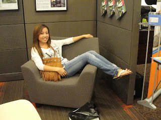
This is my friend Green and she is sitting in a chair by Herman Miller. It was design with students in mind, because when you study sometimes your legs want to hang over the edge. I think these would have been nice to have in the CUB. I also am considering this chair for my residence design in studio.

The hanging glass on this table is for privacy and folds up. I thought it would be nice to have these beautiful pieces of glass in a library setting as a privacy curtain.

This is a curtain used in a hospital. The rep explained that her company has developed the top part to have the pattern on it. Most curtains in hospitals, she said, have not been extending the pattern to the top of the fabric. I found this interesting because I am job shadowing an interior designer who works with hospital design.

This seat has an easy clean fabric and is used in waiting room settings. I thought that the easy clean fabric was actually good looking. It's good that technology has come this far to develop pretty fabrics that have good qualities, too.


These are both chairs from Knoll. I did a presentation of furniture last year and these two chairs were in our presentation. The top is the womb chair and the bottom is the diamond chair. It was interesting to see these in person and to feel the fabrics used.

This mosaic of tiles is actually has different grout on both side. on the left is a normal grout and the right side uses grout with pieces of glass in it. The grout with glass looked good with the glass tiles because they were both shiny.

These were cabinets on display and the representative was not at the table, but I really liked the quality. I read on their sign that they were from the Seattle area, which would be somewhat local to people in Washington state.

These are counter tops that are LEED certified eco friendly by Cosentino. I was thinking about using these eco counters for the bathroom in the residence I am designing in my studio. I thought that their slabs of stone were pretty, too. They are located in Spokane and I would like to visit their show room and slab yard, eventually.

This is my friend Green and she is sitting in a chair by Herman Miller. It was design with students in mind, because when you study sometimes your legs want to hang over the edge. I think these would have been nice to have in the CUB. I also am considering this chair for my residence design in studio.

The hanging glass on this table is for privacy and folds up. I thought it would be nice to have these beautiful pieces of glass in a library setting as a privacy curtain.

This is a curtain used in a hospital. The rep explained that her company has developed the top part to have the pattern on it. Most curtains in hospitals, she said, have not been extending the pattern to the top of the fabric. I found this interesting because I am job shadowing an interior designer who works with hospital design.

This seat has an easy clean fabric and is used in waiting room settings. I thought that the easy clean fabric was actually good looking. It's good that technology has come this far to develop pretty fabrics that have good qualities, too.
Habitat For Humanity 2011
At Habitat for Humanity I helped insulate the frame of the house. This home is going to have three layers of insulation so the heating bills will be less expensive and energy efficient. I only put the first layer of insulation in because the plumbing and electrical needed to be inspected, so we couldn't put all three layers up. Because the walls are going to be so thick the window wells will be pretty large and I thought that was interesting. I used measuring skills to cut the insulation that did not fit in the framing as is. I also learned how to use a drill screw gun. I drilled screws into the sub floor so that the sub floor was not popping up on the seams. I was not very good at first, but I eventually got the hang of it. The experience of being in a construction site was beneficial because I was able to see what I will be specifying when I design. I got to see how big bed rooms and bath rooms are in a home to compare to my studio project I am working on.
Sunday, September 4, 2011
Color in Interiors Context Poster

I made this poster with the help of my partner, Green Yang. To understand how to choose color for interiors it is essential to understand the basics of color theory. When choosing colors I found that it is not about picking one you like, it is about how that color will be affected by the surrounding colors. The colors of interiors should not be the last thing thought about for a design. It should be just as important as the rest of the design process, because colors have meanings to humans that need to be considered. We used two different case studies to show how color was used in interiors. The Cape Vacation Home uses an analogous color scheme of lighter greens and blues. These colors were to bring the outside in and create a relaxing atmosphere for vacationing. The Comic Book Studio has very saturated hues of red-orange and blue which show the energetic personality of the owner. The blue helps calm the high energy orange down because they are almost complimentary colors. I like the layout of this poster because it leads the eye from the first headline, to the second, and so on in a nice fashion. I also like how there is not a lot of white space. We tried to utilize all the space we could. If I could have done something different I think I would have less blue lines throughout the poster.
Subscribe to:
Posts (Atom)