Design Philosophy
I am a junior interior design major at Washington State University. I have always been interested in design. I enjoy creating abstract and organized spaces. Figuring out corrections to problems through design is a process I believe is fundamental. When I design I want to meet the needs of a client in a creative way. I like to find multiple solutions to a problem to hear opinions to consider a different approach. I think design should have meaning, and that is what I strive to tell in my designs.
Monday, November 28, 2011
Gregory Master Bathroom
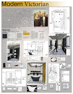
This is the poster of the master bathroom I designed for the Gregory Family Project. From this project I learned to try new layouts of how to organize my work. I started out with three columns. I kept this idea then made a circle of colorful pictures and diagonals of the black and white pictures. I coordinated the fixtures that are seen in the pictures to be below those pictures. Another option I tried was to have the fixtures in their own section, but this left too much white space. Designing this bathroom was based off of the painting "American Gothic". I chose elements and principles such as prominence, repetition, and contrast from the painting to employ into the bath design. The bathroom has a sink that is ADA accessible and a transfer/roll in shower for the clients needs. From this project I have learned that the more annotations on a technical drawing the more understandable it is. And I improved on my perspective drawing skills, though they still need more improvement.
Sunday, November 6, 2011
Common Reading Lecture by Michael P Woleott: WSU Sustainable Design and Engineer Professor
This speaker talked how he got interested in being an engineer. He was fascinated with outdoor natural beauty and how the energy crisis needed to be solved. A graph he showed was about how when we have war it is usually been over energy sources. He explained that energy is what makes us move forward, without it we do not. Another graph he showed was that to keep using as much energy as we do now will not always be an option. We will have to cut back at least 70% to sustain ourselves for the future because the population is constantly growing. Then he went into defining sustainability and how it is an economic, social, and environmental issue. He is teaching sustainability through actual problems to be solved by his students. I think that this is a great concept to teach sustainability because it has not always been around and needs to be for the future generations.
WSU Architecture and Construction Management Integrated Education Symposium Lecture
This was a lecture given by the Collins Woerman Architects and some of the people who helped them bring their design process to life. The first architect talked about how when he was in architecture school design and construction were two separate worlds. Today though, that is beginning to change. They brainstormed having the design fields collaborate and produce extraordinary results. This idea also evolved when there was an economic down turn. They wanted to try and produce a structure that would last a long time and not take a long time to build. With all the people from different fields ready to collaborate they all worked together and made the building happen in half the time it should have. A line that the one of the speakers said was, “do not tack on beauty in the end”. I enjoyed hearing this because I think that if collaboration of every field is not consulted till the end then there is not enough money for the project to feel complete. The structure they created was about natural light and I thought it was interesting that people in housing complexes will pay more to have a room with the most natural light. I will employ this concept in my future designs. The second speaker talked about why collaboration has not worked in the past and how it worked in the benefit of this project. He said that people for other disciplines do not tell other disciplines what to fix or change because if something goes wrong then it is someone’s fault and will cost them more money. The way this structure was built was about collaborating, so if one discipline did not suggest an idea of how to build a part of the structure it would have taken twice as long to construct. Another line I liked was, “just because industry doesn’t do it doesn’t mean it can’t happen, if you collaborate new ideas will emerge”. I thought this was the key to success, because in our studios we collaborate and critique each other’s work and it helps us evolve our ideas and grow.
Sunday, October 16, 2011
Job Shadow at Callison
I went on a job shadow with an interior designer in the healthcare department at Callison architecture firm. At the job shadow I was able to see what it is like to work in a studio with a bunch of professionals. I got to see integration of architects and interior designers, which was interesting because the WSU school of design will be collaborating like what happens in a real studio. I got to see lots of materials that were cutting edge, too. Their materials room had many different types of lighting so that materials could be seen in the type of lighting that would be on site. I went to a job site with my designer and it was interesting to see something that she had in floor plans and elevations in person.
Here is a link to the Callison healthcare department website to see some of the projects they have done.
St. Ignatius Church Sketches
This is a church in Seattle, Washington that I was able to sketch. It was built by an architect that had the concept of St. Ignatius' writings. I do not know the writings of St. Ignatius, but I heard they had to do with light being God. The architecture of this church captures lighting in many different ways through windows and ceiling heights that create shadows. From these sketches I strengthen my sketching abilities, and I learned what can be done with lighting in a space.
This is an exterior view of the entrance into the church. The windows on the door let light into the structure at different angles.
This is a sketch of a wall that had a protruding wall coming out of it. This wall let light into the church through different size openings. My note says that their are 6 windows and the 7th is God, which is light. This has to do with one of the writings St. Ignatius wrote.
This is a view of the entry lobby of the church. Here the texture is seen on the walls which casts shadows because of all the light shined on them. All of the walls were curving and seemed to be connected as on and not different pieces put together. The texture on the wall makes the building look seamless.
This is a view from in the church and the ceiling heights are seen here. The different openings and how walls are lit from behind shows how God is shining into the church. As I sat in this church it was interesting to see how the lighting changed when the sun changed position.
Some of these figures I was not clear behind their meaning, but I am sure it is based on St. Ignatius. I thought that lots of the figures were organic in shape which was bringing in nature and light from outdoors.
This is an exterior view of the entrance into the church. The windows on the door let light into the structure at different angles.
This is a sketch of a wall that had a protruding wall coming out of it. This wall let light into the church through different size openings. My note says that their are 6 windows and the 7th is God, which is light. This has to do with one of the writings St. Ignatius wrote.
This is a view of the entry lobby of the church. Here the texture is seen on the walls which casts shadows because of all the light shined on them. All of the walls were curving and seemed to be connected as on and not different pieces put together. The texture on the wall makes the building look seamless.
This is a view from in the church and the ceiling heights are seen here. The different openings and how walls are lit from behind shows how God is shining into the church. As I sat in this church it was interesting to see how the lighting changed when the sun changed position.
Some of these figures I was not clear behind their meaning, but I am sure it is based on St. Ignatius. I thought that lots of the figures were organic in shape which was bringing in nature and light from outdoors.
Sunday, October 9, 2011
Jim Olson Lecture 2011
Jim Olson is an architect in Seattle, Washington. His lecture was based on how he has been inspired throughout his life by nature and how he brings that inspiration into his architecture. He grew up working with his hands and wanted to do something that made him happy, so he chose architecture. He started out with his family cabin on the Puget Sound that had a window which framed Mount Rainer. This mountain is a symbol of accomplishment to him because his grandmother climbed it twice. This area of the Puget Sound is significant because Olson designed himself a cabin that he still goes to when he wants to relax. He showed a picture of a flower that you can see in the woods around his cabin. They are visible because they are light and contrast to the dark green tree backdrop. This is because flowers want to be noticed by bees so they will be pollinated. The flowers came back into his lecture when he talked about a painting that was hung in a home. The wall was dark and the painting was light. This made the painting become the focus on the wall like the flowers in the woods. He did a lot with windows that were almost invisible to people because the nature on the outside was so beautiful that it became apart of the design. He made a statement I enjoyed which was, "let the nature frame the home and the home frame the art". This is displayed in the architecture of the home with the large women statue. From many angles when looking into the home the nature is first what is noticed, then the home's architecture, and then the art figure is seen through windows. I was inspired by this mans passion for his career. I enjoy people in the design field who can be successful in their career and have a family. He was very good at explaining the concept and meaning behind his work. I think that design should always have meaning or else your design can not seem valid to everyone.
This link is to the Olson Kundig website for a photo of the house with the statue in it. http://www.olsonkundigarchitects.com/gallery_cache/2038/800_600/WSU-Postcard.jpg
Wheel Chair Experience
My partner and I experienced what it is like to be in a wheel chair. Our experience is only a little of what someone in a wheel chair deals with every second of everyday. I have to say design should revolve around them. Not every person will be in a wheel chair in their life, but may know someone who is in one. To watch them suffer in their day to day activities is not okay. From my wheel chair experience I learned that rooms should have enough turning radius, which is five feet. It is also very hard to open doors or a refrigerator. Some are too heavy, while other have are hard to reach spaces once the door is open. You also need lots of upper body strength to pull a door open and move the wheel chair back. I would highly recommend automatic opening doors. Ramps are another issue because they are not always pointed out to people not in wheel chairs. It would be time consuming to go between classes and not be able to find the elevator or ramps fast enough. The hills in Pullman are hard to avoid and are scary when that is your only option. Reaching for books in the library was difficult and the copy machine was hard to reach into. The restrooms were a plus because there was enough space for toilet transfer. The sink, soap dispenser, and paper towels were also very accessible. My partner had issues with the wheel chair in the restroom she entered, it had no turning radius. She also went to a coffee stand and the counter was so tall she could not reach the cashier. From this experience I learned that good design is not just about whether something looks good, but that it needs to be functional for every person.
Subscribe to:
Posts (Atom)


