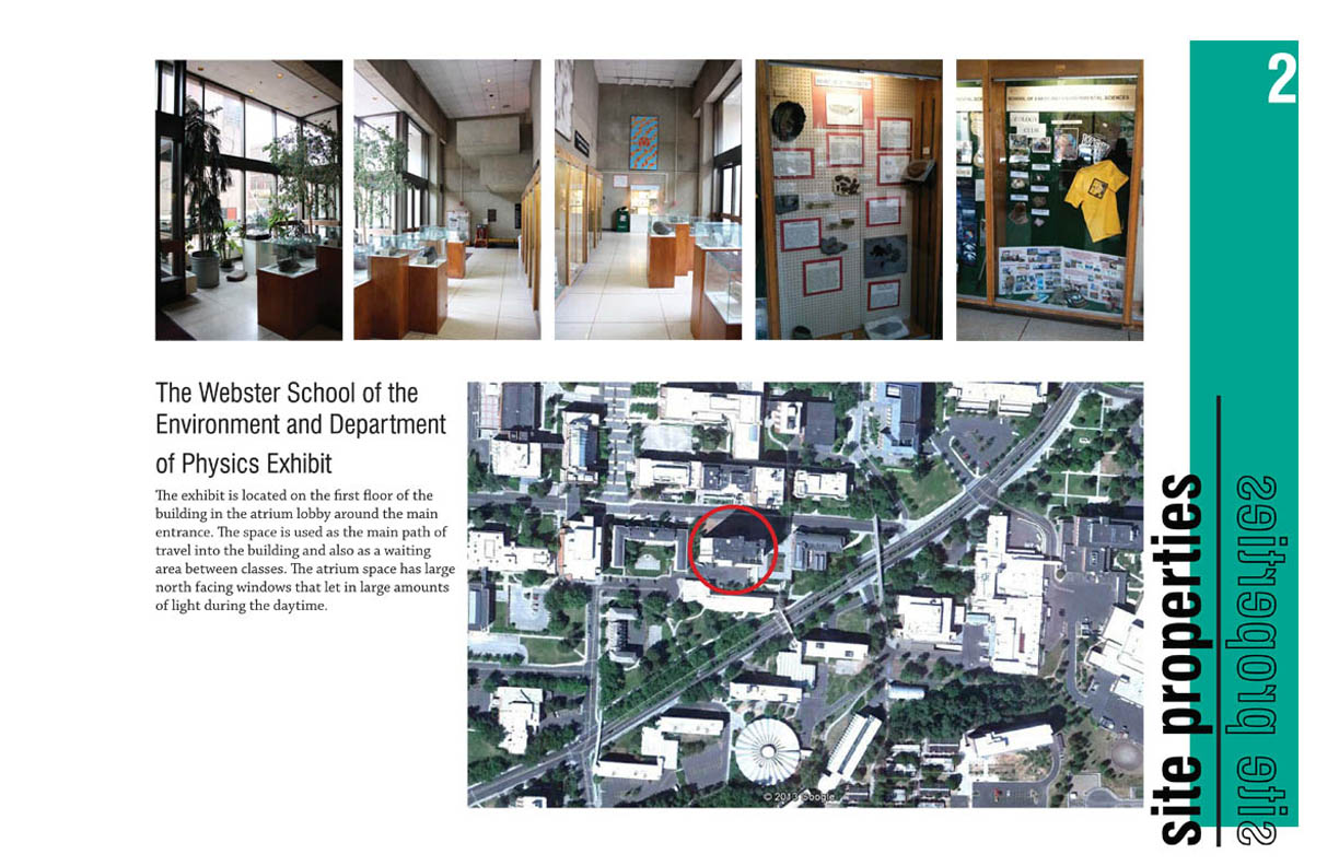
The geology-environmental sciences-physics exhibit in Webster Hall is on the Washington State University campus. This geology exhibit showcases seven display wall cases and eight moveable cases on the floor. The physics displays are six interactive exhibits. The flow of the space before was not conducing to bringing people into the exhibition space. This may be due to the out of date content being displayed. My team of nine and I brainstormed ways to bring the public into the exhibition space through design.
Credit: Kimberly Cox, Megan Pharmer
Credit: Kimberly Cox, Megan Pharmer
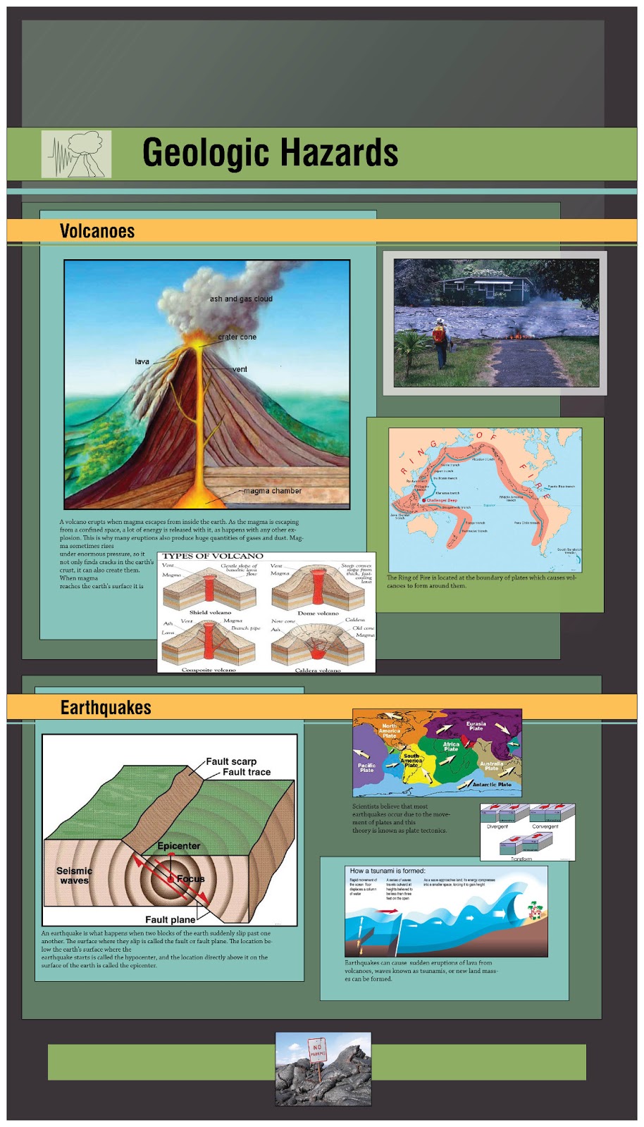
We started off by creating a chronological story in the seven geology wall displays. My team and I each researched a topic and then one team member created the graphic displays. I believe our displays are cohesive and create hierarchy, but seem to be on the dark side. That is not a bad thing though because of the strong daylight of the windows, this dark background will provide contrast.
Content Credit: Kimberly Cox, Megan Pharmer; Graphic Display: Elizabeth Jurgeleit

Content Credit: Kimberly Cox, Megan Pharmer; Graphic Display: Elizabeth Jurgeleit
To make the geology wall displays more interactive we added some hands on learning components. Such as this one with moving blocks to learn about the different boundary types. I know when I took the Geology 101 course I had trouble remembering the boundary types, I feel like a tactile model will be beneficial to learning.
Credit: Megan Pharmer
The light study I did was at night to see how the electric lights were displaying the material. The lights were strongest in the wall display cases. During the day the daylighting was where the brightest light was at.
Day Study
Credit: Alicia Brandkamp, Taylor Brock
Night Study
Credit: Kimberly Cox, Megan Pharmer
The circulation plan we developed is to create a crossing flow of people. They do not need to go straight back to the elevators, the open feel with the benches will bring people into the space. Because there are now benches centrally located this will attracted people to stay awhile and enjoy the exhibit. Through the development of the floor plan the circulation was thought of. I found circulation to be a large contributor in the placement of objects. I think I strengthen my reconfiguring skills during this project because the existing furniture and components all needed to stay in the space.
Credit: Megan Pharmer
The physics interactives are interesting, but have out of date signage. It is long text that is written in a formal matter. We did not “dumb” the content down; we just reorganized it with the use of color to create hierarchy and attraction.
I also helped with the graphic display and content of the program for this project. From this part of the project I strengthened my graphic design and my use of design language skills.
Credit: Marit Pinkoske, Megan Pharmer
Credit: Marit Pinkoske, Megan Pharmer
Credit: Marit Pinkoske, Megan Pharmer
Credit: Marit Pinkoske, Megan Pharmer
This project was done in a group of nine, which is one of the largest teams I’ve worked in. I enjoyed seeing the collaboration of group members on tasks, as well. We all had our partners within the group that we could work on our parts with. All nine of us checked in periodically to see how others were getting along with their parts.
I think this project helped me strengthen my organization skills and meeting deadlines. Working with a small budget was interesting to create simple solutions that will make a large impact in the space. Small changes can lead to the outcome that we want in the space which is for people to enjoy it and learn.