Design Philosophy
I am a junior interior design major at Washington State University. I have always been interested in design. I enjoy creating abstract and organized spaces. Figuring out corrections to problems through design is a process I believe is fundamental. When I design I want to meet the needs of a client in a creative way. I like to find multiple solutions to a problem to hear opinions to consider a different approach. I think design should have meaning, and that is what I strive to tell in my designs.
Thursday, February 16, 2012
Habitat For Humanity Design
My partner and I developed a concept to drive our design of this Habitat For Humanity home. Home means, to us, family, comfort, and sustainable living. We employed the aspect of family in our large great room where a family can act as a whole. Comfort is also seen in the great room through movement of visual and physical connectedness. And sustainable living means a place where a family can grow with ease. We used ADA guidelines and sustainable materials and finishes throughout this design.
To create a sense of entry in this 1100 square foot home we added a window at the end of the hall. Since we thought about putting a linen closet where this window is located we decided to make an efficient walk through utility room to house more storage, as well. And possibly acting as a linen area. The utility room also has a pantry that was asked to be incorporated into the design. With the water heater being centrally located we tried to have all plumbing be located near this spot. To create a sense of a dining area we established a built in bench that is able to be transferred to by wheel chair or there is room for a wheel chair user to roll up to the table edge. The kitchen has PaperStone counter tops which are made of 100% post consumer paper, so they are sustainable. The bar in the kitchen also provides more seating for a homework area or entertaining. The living room has a larger layout which provides many versatile arrangements for an active family life. Cork flooring is used throughout the dry areas of the home and is sustainable to tree life. In the wet areas, such as utility and bathrooms vinyl flooring was used. To incorporate ADA guidelines we have a 5 foot turning radius in the master bathroom,a toilet with a front and side approach, and a wall mount sink. All doors are 36" wide and the hallway is 48" wide. The kitchen also has a 5 foot turning radius and a 9 inch toe kick. The exterior doors open out because the site this home is designed for has high winds which would blow on the doors if they were to open into the home.
From this partner project I valued working with a partner to get the job done efficiently. With a partner much more can be accomplished with the work of two people. I enjoyed researching new products for Habitat members to consider. Overall I enjoyed delivering creative ideas to the community.
Friday, December 16, 2011
Gregory Grandparent's Apartment
This project is an accessory dwelling unit attached to a family apartment. The people living in this apartment are the grandparents. They are not in wheel chairs, but their daughter is so the apartment was designed to meet her needs, too. The color palette was inspired by the palouse, which are reds, greens, golds, and browns. From my concept I derived the elements and principles of repetition, movement, and gradation. I employed those in the design of this apartment in the furniture, finishes, and layout of the apartment. These presentation boards are organized in different board sizes that fit like puzzle pieces and complement each other. The orange striping bring one from the first board to the last. The title first jumps out and should because it is the starting point of my process, the title of my inspiration song. The critiques I received from this project will be taken to my future projects.
Meeting with an interior designer
Over Thanksgiving break I met with an interior designer to discuss a project I was working on. This meeting was very insightful. She gave me many ideas of how to fix some layout issues. I took her advice and I do like the final project even more than I did before we met. I enjoy having others take a look at my work to see how they perceive them, and see how they could be done differently.
Monday, November 28, 2011
Gregory Kitchen Design
This kitchen poster is not a very final poster, but it is to give me an idea of how I would layout a final poster. That is why pieces are taped on. The kitchen on this poster is for the Gregory family who has a handicapped family member. From the beginning of this design that aspect was kept in mind, to make the kitchen useful for every member. The concept focus' on movement, repetition, and gradation. The "L" shape of the kitchen creates movement in and out of the kitchen. The existing brick shape of the exterior walls was repeated in the kitchen backsplash. Gradation is present in the slanted wall and then in the slanting ceiling height getting taller. I organized my poster boards so that their was a good balance between the larger plans and the smaller elevations by not putting all the large ones at the top or bottom of the poster. For future posters I will make them less draft like and more professional.
Gregory Master Bathroom
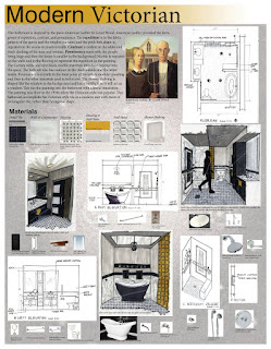
This is the poster of the master bathroom I designed for the Gregory Family Project. From this project I learned to try new layouts of how to organize my work. I started out with three columns. I kept this idea then made a circle of colorful pictures and diagonals of the black and white pictures. I coordinated the fixtures that are seen in the pictures to be below those pictures. Another option I tried was to have the fixtures in their own section, but this left too much white space. Designing this bathroom was based off of the painting "American Gothic". I chose elements and principles such as prominence, repetition, and contrast from the painting to employ into the bath design. The bathroom has a sink that is ADA accessible and a transfer/roll in shower for the clients needs. From this project I have learned that the more annotations on a technical drawing the more understandable it is. And I improved on my perspective drawing skills, though they still need more improvement.
Sunday, November 6, 2011
Common Reading Lecture by Michael P Woleott: WSU Sustainable Design and Engineer Professor
This speaker talked how he got interested in being an engineer. He was fascinated with outdoor natural beauty and how the energy crisis needed to be solved. A graph he showed was about how when we have war it is usually been over energy sources. He explained that energy is what makes us move forward, without it we do not. Another graph he showed was that to keep using as much energy as we do now will not always be an option. We will have to cut back at least 70% to sustain ourselves for the future because the population is constantly growing. Then he went into defining sustainability and how it is an economic, social, and environmental issue. He is teaching sustainability through actual problems to be solved by his students. I think that this is a great concept to teach sustainability because it has not always been around and needs to be for the future generations.
WSU Architecture and Construction Management Integrated Education Symposium Lecture
This was a lecture given by the Collins Woerman Architects and some of the people who helped them bring their design process to life. The first architect talked about how when he was in architecture school design and construction were two separate worlds. Today though, that is beginning to change. They brainstormed having the design fields collaborate and produce extraordinary results. This idea also evolved when there was an economic down turn. They wanted to try and produce a structure that would last a long time and not take a long time to build. With all the people from different fields ready to collaborate they all worked together and made the building happen in half the time it should have. A line that the one of the speakers said was, “do not tack on beauty in the end”. I enjoyed hearing this because I think that if collaboration of every field is not consulted till the end then there is not enough money for the project to feel complete. The structure they created was about natural light and I thought it was interesting that people in housing complexes will pay more to have a room with the most natural light. I will employ this concept in my future designs. The second speaker talked about why collaboration has not worked in the past and how it worked in the benefit of this project. He said that people for other disciplines do not tell other disciplines what to fix or change because if something goes wrong then it is someone’s fault and will cost them more money. The way this structure was built was about collaborating, so if one discipline did not suggest an idea of how to build a part of the structure it would have taken twice as long to construct. Another line I liked was, “just because industry doesn’t do it doesn’t mean it can’t happen, if you collaborate new ideas will emerge”. I thought this was the key to success, because in our studios we collaborate and critique each other’s work and it helps us evolve our ideas and grow.
Subscribe to:
Posts (Atom)