The Reveal Materials Expo was a real good experience for me. Learning about products is one thing, but being able to talk to representatives for the product and seeing the new items is eye opening. These photos are some of the products I found interesting.
These are both chairs from Knoll. I did a presentation of furniture last year and these two chairs were in our presentation. The top is the womb chair and the bottom is the diamond chair. It was interesting to see these in person and to feel the fabrics used.
This mosaic of tiles is actually has different grout on both side. on the left is a normal grout and the right side uses grout with pieces of glass in it. The grout with glass looked good with the glass tiles because they were both shiny.
These were cabinets on display and the representative was not at the table, but I really liked the quality. I read on their sign that they were from the Seattle area, which would be somewhat local to people in Washington state.
These are counter tops that are LEED certified eco friendly by Cosentino. I was thinking about using these eco counters for the bathroom in the residence I am designing in my studio. I thought that their slabs of stone were pretty, too. They are located in Spokane and I would like to visit their show room and slab yard, eventually.
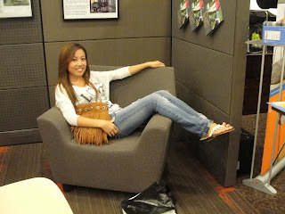
This is my friend Green and she is sitting in a chair by Herman Miller. It was design with students in mind, because when you study sometimes your legs want to hang over the edge. I think these would have been nice to have in the CUB. I also am considering this chair for my residence design in studio.
The hanging glass on this table is for privacy and folds up. I thought it would be nice to have these beautiful pieces of glass in a library setting as a privacy curtain.
This is a curtain used in a hospital. The rep explained that her company has developed the top part to have the pattern on it. Most curtains in hospitals, she said, have not been extending the pattern to the top of the fabric. I found this interesting because I am job shadowing an interior designer who works with hospital design.
This seat has an easy clean fabric and is used in waiting room settings. I thought that the easy clean fabric was actually good looking. It's good that technology has come this far to develop pretty fabrics that have good qualities, too.
Design Philosophy
I am a junior interior design major at Washington State University. I have always been interested in design. I enjoy creating abstract and organized spaces. Figuring out corrections to problems through design is a process I believe is fundamental. When I design I want to meet the needs of a client in a creative way. I like to find multiple solutions to a problem to hear opinions to consider a different approach. I think design should have meaning, and that is what I strive to tell in my designs.
Sunday, September 25, 2011
Habitat For Humanity 2011
At Habitat for Humanity I helped insulate the frame of the house. This home is going to have three layers of insulation so the heating bills will be less expensive and energy efficient. I only put the first layer of insulation in because the plumbing and electrical needed to be inspected, so we couldn't put all three layers up. Because the walls are going to be so thick the window wells will be pretty large and I thought that was interesting. I used measuring skills to cut the insulation that did not fit in the framing as is. I also learned how to use a drill screw gun. I drilled screws into the sub floor so that the sub floor was not popping up on the seams. I was not very good at first, but I eventually got the hang of it. The experience of being in a construction site was beneficial because I was able to see what I will be specifying when I design. I got to see how big bed rooms and bath rooms are in a home to compare to my studio project I am working on.
Sunday, September 4, 2011
Color in Interiors Context Poster
I made this poster with the help of my partner, Green Yang. To understand how to choose color for interiors it is essential to understand the basics of color theory. When choosing colors I found that it is not about picking one you like, it is about how that color will be affected by the surrounding colors. The colors of interiors should not be the last thing thought about for a design. It should be just as important as the rest of the design process, because colors have meanings to humans that need to be considered. We used two different case studies to show how color was used in interiors. The Cape Vacation Home uses an analogous color scheme of lighter greens and blues. These colors were to bring the outside in and create a relaxing atmosphere for vacationing. The Comic Book Studio has very saturated hues of red-orange and blue which show the energetic personality of the owner. The blue helps calm the high energy orange down because they are almost complimentary colors. I like the layout of this poster because it leads the eye from the first headline, to the second, and so on in a nice fashion. I also like how there is not a lot of white space. We tried to utilize all the space we could. If I could have done something different I think I would have less blue lines throughout the poster.
Subscribe to:
Comments (Atom)


